Shell styling is a powerful feature within Assette’s Brand Themes that allows users to design and customize not just the layout of their documents, but also the appearance of tables, charts, and labels. It provides flexibility for creating distinct styles across different data object buckets, ensuring a consistent look while enabling variations based on specific needs.
With shell styling, users can define default styles for tables, charts, and labels that apply to all data objects within a bucket. For instance, users can create a default table style that ensures all tables look uniform across various documents. However, if there’s a need for specific customization, such as a different style for performance-related data, users can design and apply a unique style for tables when performance data objects are in use. This same customization can be applied to charts and labels, giving users control over how each feature is displayed depending on the type of data object being used.
Creating Shell Styles #
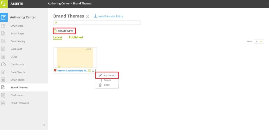
To create a Shell Style, the user can navigate to the Brand Theme feature within the Authoring Center and either create a new theme or edit an existing one. This process opens the PowerPoint editor, similar to when editing Brand Themes.
The Slide Master tab in PowerPoint offers a range of tools that allow users to customize their presentation’s layout and design to align with their branding needs. Within this tab, users can access native PowerPoint features to create a cohesive look across all slides. For instance, the Insert Slide Master and Insert Layout options allow users to add new slide templates or layouts, giving them control over the structure and style of their presentation.
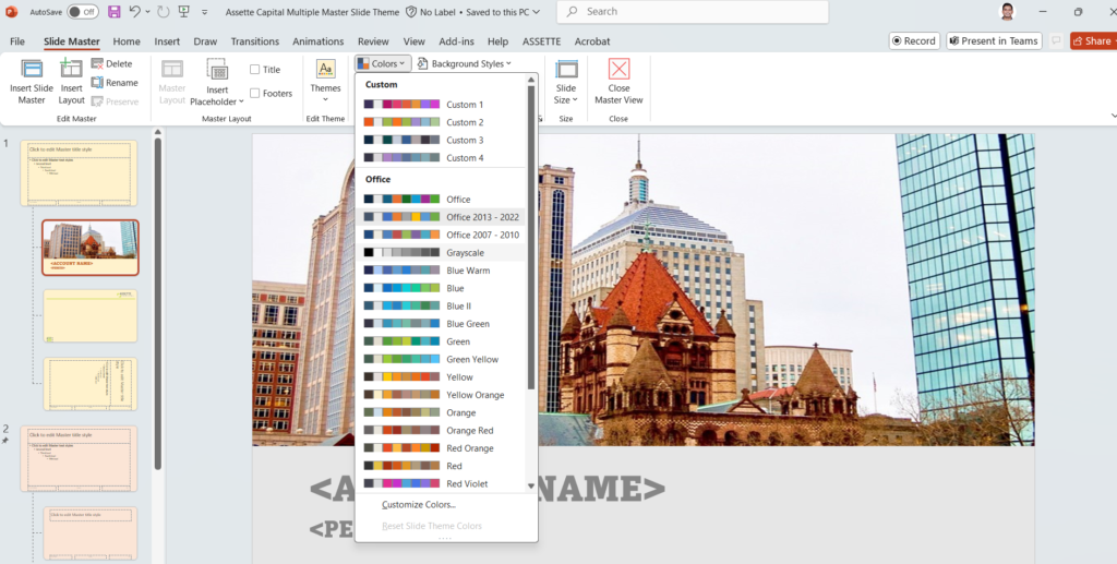
The Themes section in the Slide Master tab enables users to select and customize themes, ensuring that the overall style—such as colors, fonts, and effects—aligns with the organization’s branding. Within this section, the Colors option allows users to define specific color accents, which play a critical role in maintaining brand consistency across the presentation. These color accents are applied not only to text and backgrounds but also to elements like inserted tables, charts, and SmartArt, which will automatically adopt these accent colors. This ensures a uniform look throughout, so any visual elements align seamlessly with the defined brand colors.
By setting these color accents, users can be confident that all tables, charts, and graphical elements within the presentation will reflect the selected color palette, enhancing brand cohesion and professionalism. This feature is particularly valuable for organizations that want to ensure every detail of the presentation supports their visual identity, from headers to data visualizations, with consistent color application.
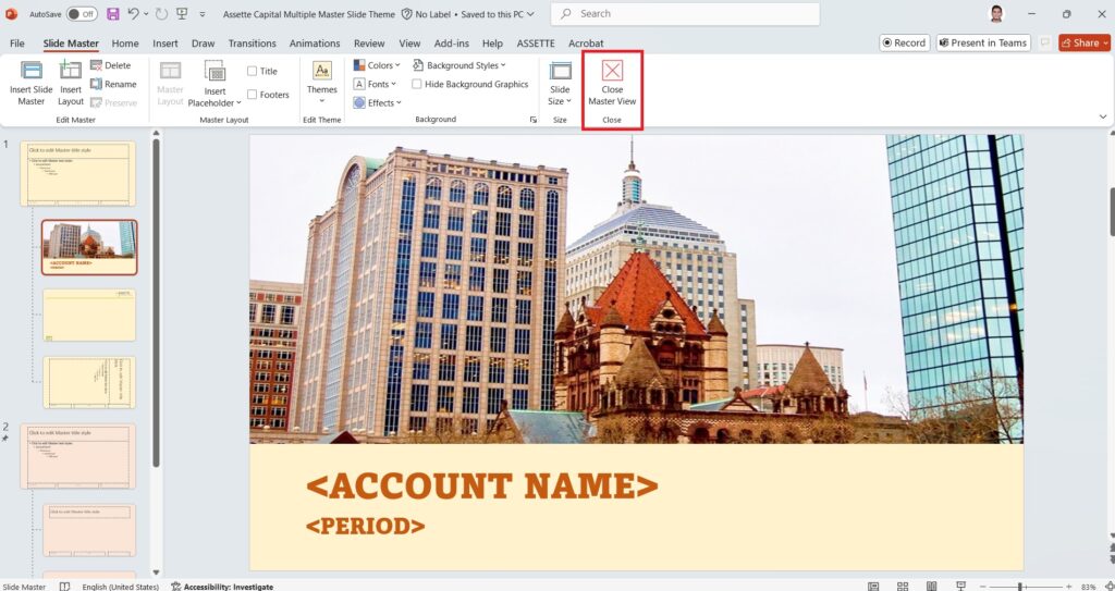
Lastly, the Close Master View button allows users to exit the Slide Master and return to the normal view, applying all changes across the presentation. This suite of tools in the Slide Master tab provides users with powerful options to craft a consistent and professional presentation that meets their specific design requirements.
Creating Table Style #
Once the user has closed the Master Slide view and returned to the normal slide mode, they can proceed by inserting a table. The initial colors applied to the table will follow the selected color accents from the Master Slide, ensuring a cohesive look that aligns with the chosen theme. However, users have the flexibility to further customize the table’s design to suit specific needs.
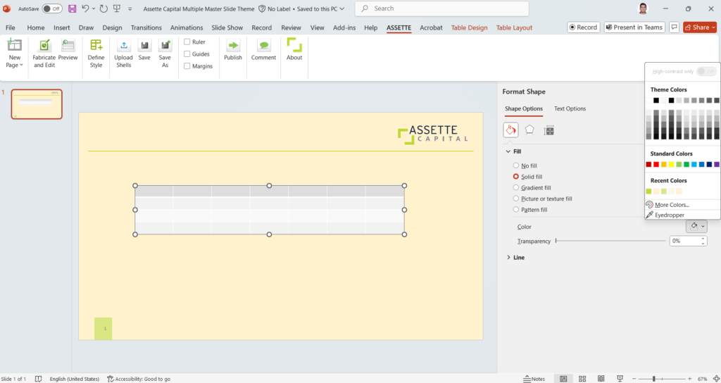
Using PowerPoint’s menu options, they can adjust elements such as font, colors, borders, and other visual aspects, giving them control over the final appearance. These customizations establish the style that will be applied whenever this type of table is used in future documents, ensuring consistent styling across all tables linked to the same data object or category. Additionally, users can apply shell styling as desired, allowing for even more tailored adjustments that meet unique branding or presentation requirements.
After customizing the table design, the user can select the Define Style option from the Assette menu. This will open a tab on the right side of PowerPoint, allowing the user to tag the style to a specific data category or set it as a default style. The user can select the appropriate option from the Data Category drop-down menu.
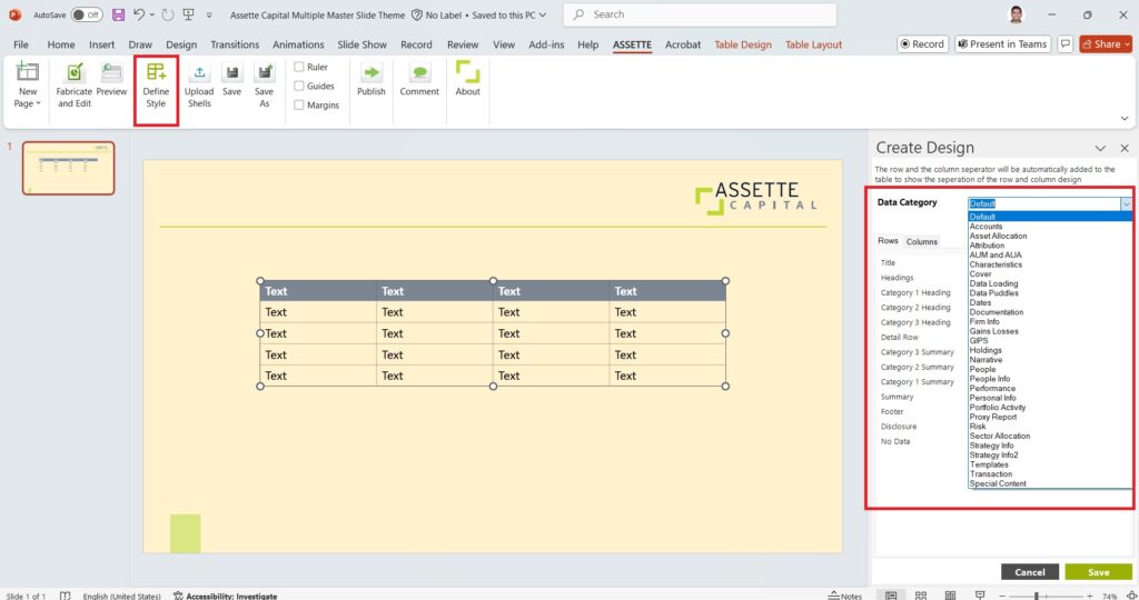
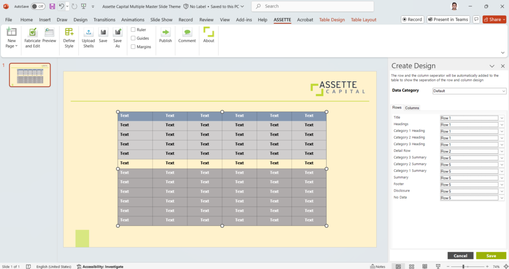
For tables specifically, the user will need to map how different rows should appear. Various row types—such as Title, Headings, Category Heading, Detail Row (Data Row), Category Summary, Summary, Total, and Footer—can each be styled based on the design the user has created. Each of these rows must be mapped to the appropriate visual settings within the table that was inserted.
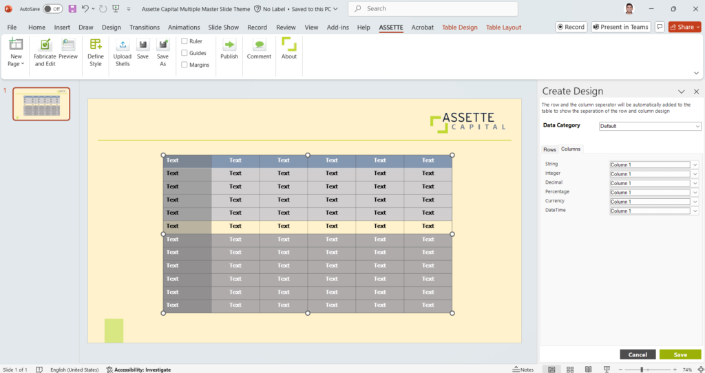
Similarly, for columns, the user needs to map how the output design should appear based on the data type—whether it’s a String, Integer, Decimal, Percentage, Currency, or DateTime. Depending on the type of data in the column, the user can select the appropriate design settings for each type of output.
Creating Shell Style #
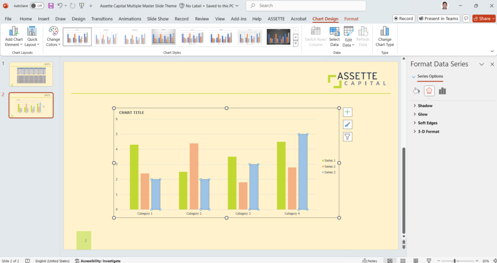
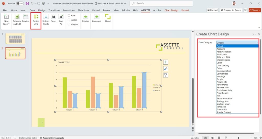
To begin designing a column chart in Assette’s Shell Styling, the user must first insert a column chart in slide mode. This is done using the standard PowerPoint options available for creating charts. The chart will serve as the base structure, allowing the user to arrange it according to the specific requirements of the document, such as designing the categories and data series that will be visualized.
Next, the user customizes the design of the chart using PowerPoint’s menu options. This step involves setting the colors for the chart’s columns, adjusting the chart’s accents, and modifying other visual elements like fonts, borders, and axis labels.
Once the chart is fully customized, the user selects the Define Style option from the Assette menu. This opens a tab on the right side of the screen where the user can choose to tag the design either as a default style or as one that is specific to a certain data category. By selecting a category from the drop-down menu, the user ensures that the style is applied whenever charts linked to that particular category are generated, allowing for consistency in visual representation across different documents.
Finally, the user can publish the Brand Theme, ensuring that the shell styles defined within it remain consistent whenever the theme is used. This feature allows users to design various chart types and labels that will automatically align with the brand’s visual standards. If no workflow is configured, the Brand Theme will be published immediately upon completion. However, if a workflow approval process is set up for the Brand Theme, the design will be sent for approval. The designated approver will receive a notification, and only once approval is granted will the Brand Theme be available for use. This ensures that all branding elements are thoroughly reviewed and adhere to company standards before being implemented.